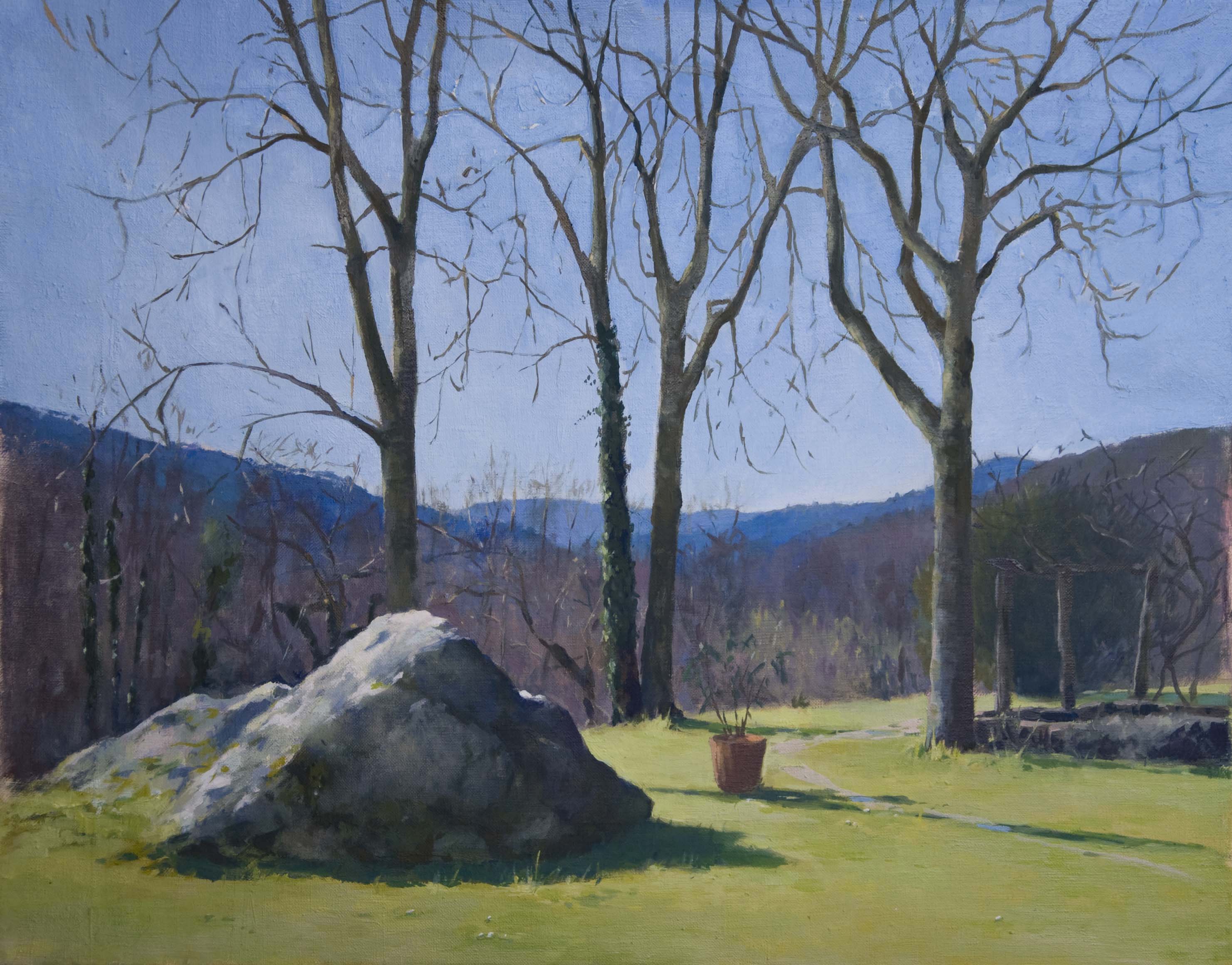
What I find interesting in painting outside is for example what happens when the sky blue, why on sunny days are the distant hills purple, and the closer ones blue/green etc? Trying to understand the answers helps me paint more quickly instead of guessing which colours to put where.
Most of the time I begin or end up painting the sky too dark, forgetting that it is the lightest value in the landscape even when it is bright blue like this or overcast. The sky is really important, once you paint in the right colour then it will help anchor the rest of the painting. There is no such thing as flat tone in nature even though the sky may seem to be just blue, infact it is a huge space with more than just one value which changes towards or away from the sun and from the horizon to the zenith even on a grey cloudy day. As you go closer to the sun you are faced with a colourless glare, and then across the horizon in the opposite direction the blue gradually gets darker. The horizon being the farthest away point from us is lighter because there is more atmosphere to see through and the zenith above our heads is the darkest area as it reaches into space.
Here is a grid with the mixed blue values I used in the sky above:

Horizon = cerulean blue, white
Zenith = Ultramarine, cobalt blue light, white
Left = cerulean blue, white, cobalt blue light, white
Right = cobalt blue light, ultramarine blue, white
Whatever we paint is lighted according to the time of day and the weather because the particles that make up the atmosphere surround and affect everything we see. I did this painting at midday, there were no green leaves on the trees so the scene cast an overall blue hue because of the sky colour that was reflecting off the ground, rock and trees etc.
Sometimes when I get stuck I find it helps to take a photograph of the painting and then change the photo into black and white. If it is too grey and lacks contrast then the values do not have weight, most of the time it’s the sky that is too dark so I try and remember why it is and how it is and then next time it might help me paint more quickly and without guessing where to put the colours!

This was a really informative post, Anna. Thank you for sharing.
LikeLiked by 1 person
Thanks so much Heidi, you are welcome!!
LikeLike
Beautiful, I love the trees with the sky back drop and the shadowing…wow. I love painting skies myself and I always find myself having a hard time trying to find the right blue. Thank you so much for the information, It will come in handy for the next landscape painting. Wonderful post 🙂
LikeLiked by 1 person
thanks so much Isabel, it was fun writing it and I hope you find it useful in your next landscape painting. Happy painting 🙂
LikeLike
Love this painting. And enjoyed reading your post too! ~Rita
LikeLiked by 1 person
thank you 🙂
LikeLiked by 1 person