Paths and a Patch.

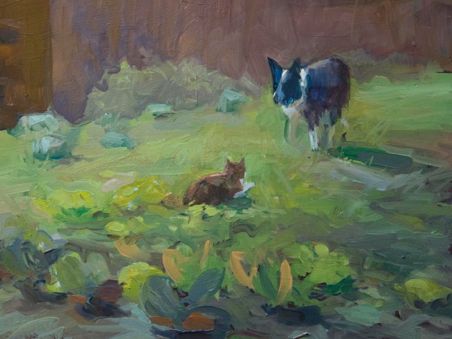
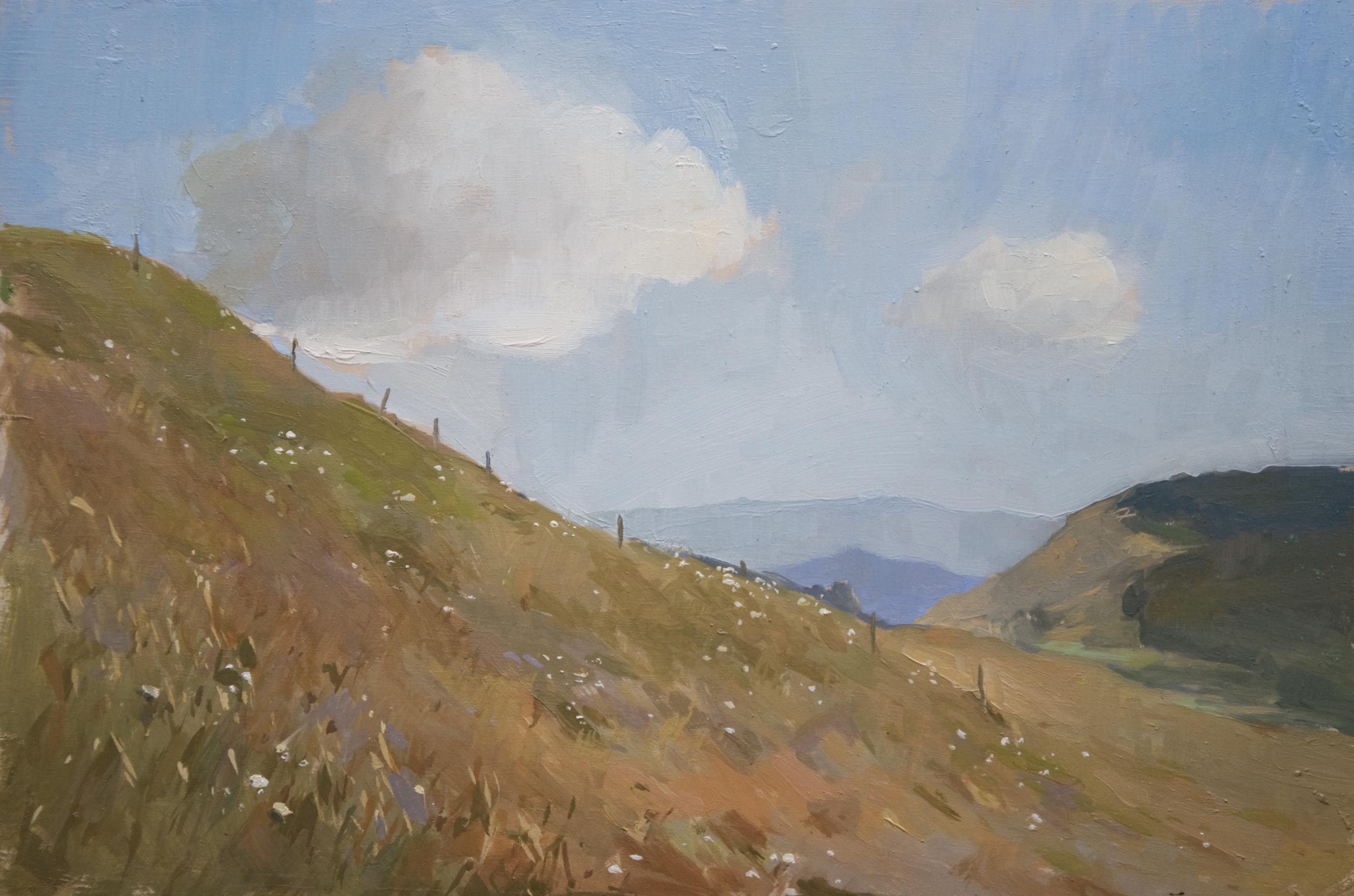
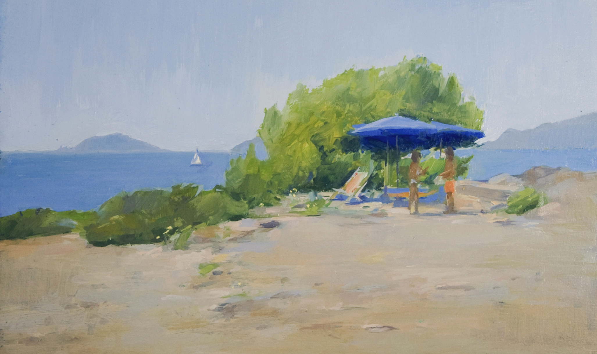
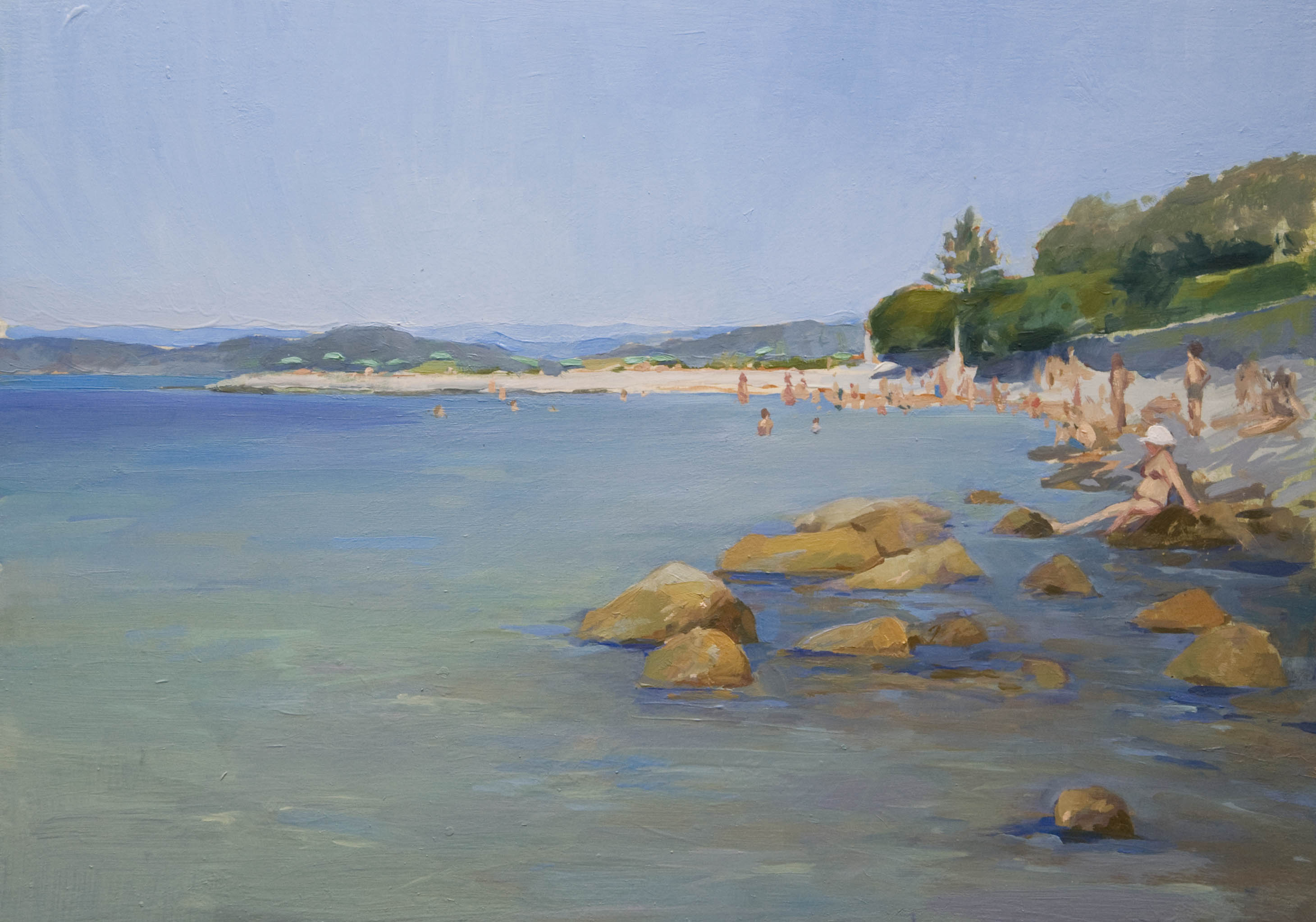
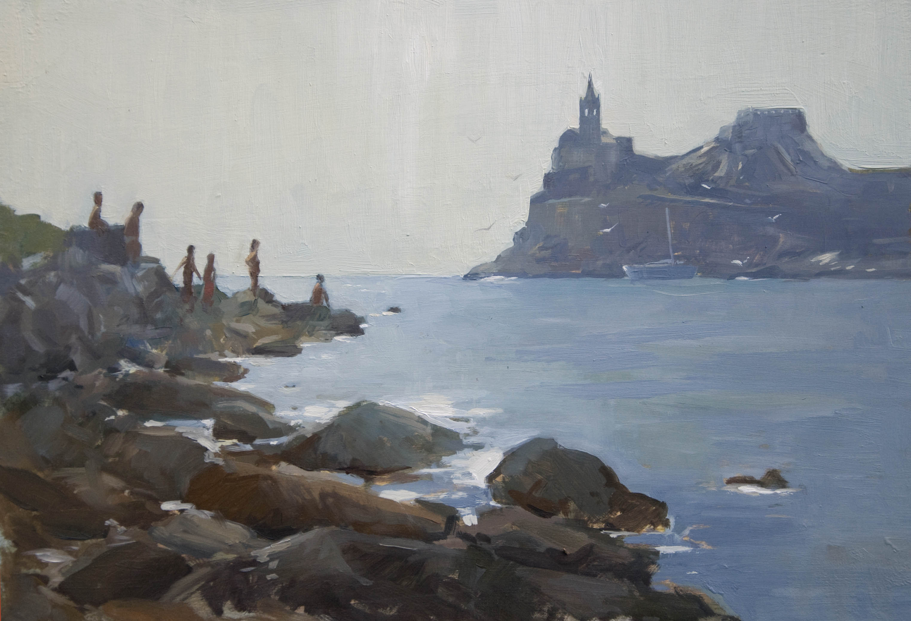
Here are some paintings of where I live in Liguria, Italy.  They were all done in Spring and from life hence the spring greens.

thewaytosantamaria_oilpainting_annadennis
The Way to Santa Maria. 60cm x 50cm, oil on panel.

There is a man in Santa Maria, this small hamlet above who once gave us some delicious onion sets from seeds that he has been using from the past fifty years, and before.  They are the sweetest onions to be eaten raw in salads or stuffed.  Not many people around here buy seeds but have been reseeding from the existing plant.  So they say the tomatoes that are easily diseased are always the seeds bought from the mass producers in the shops!

pathinspring
Path in Spring. 35cm x 45cm, oil on wood.

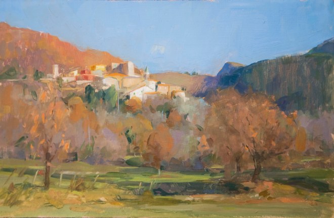
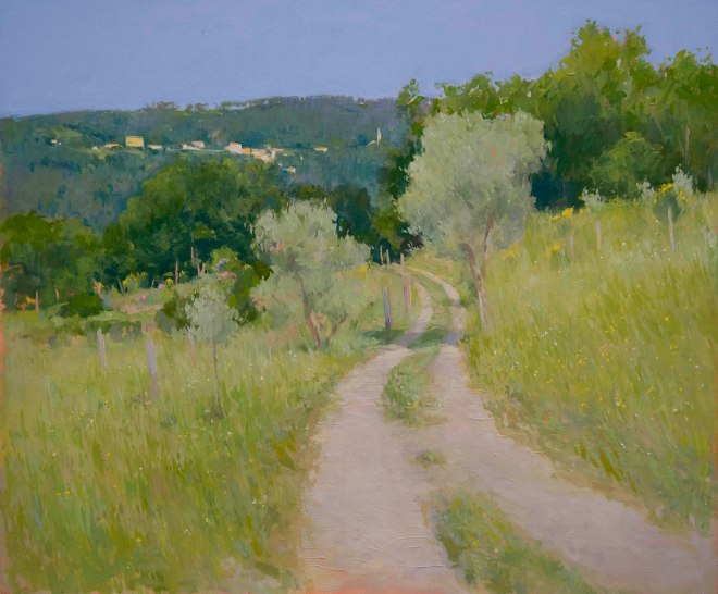
This road takes you to another nearby village called Sasseta. Thirty years ago there was only a mule track but times have changed and there is now a road which even more bumpy than the mule track.

inthegarden_oilpainting2_annadennis
In the Garden. 75cm x 90cm, oil on canvas.

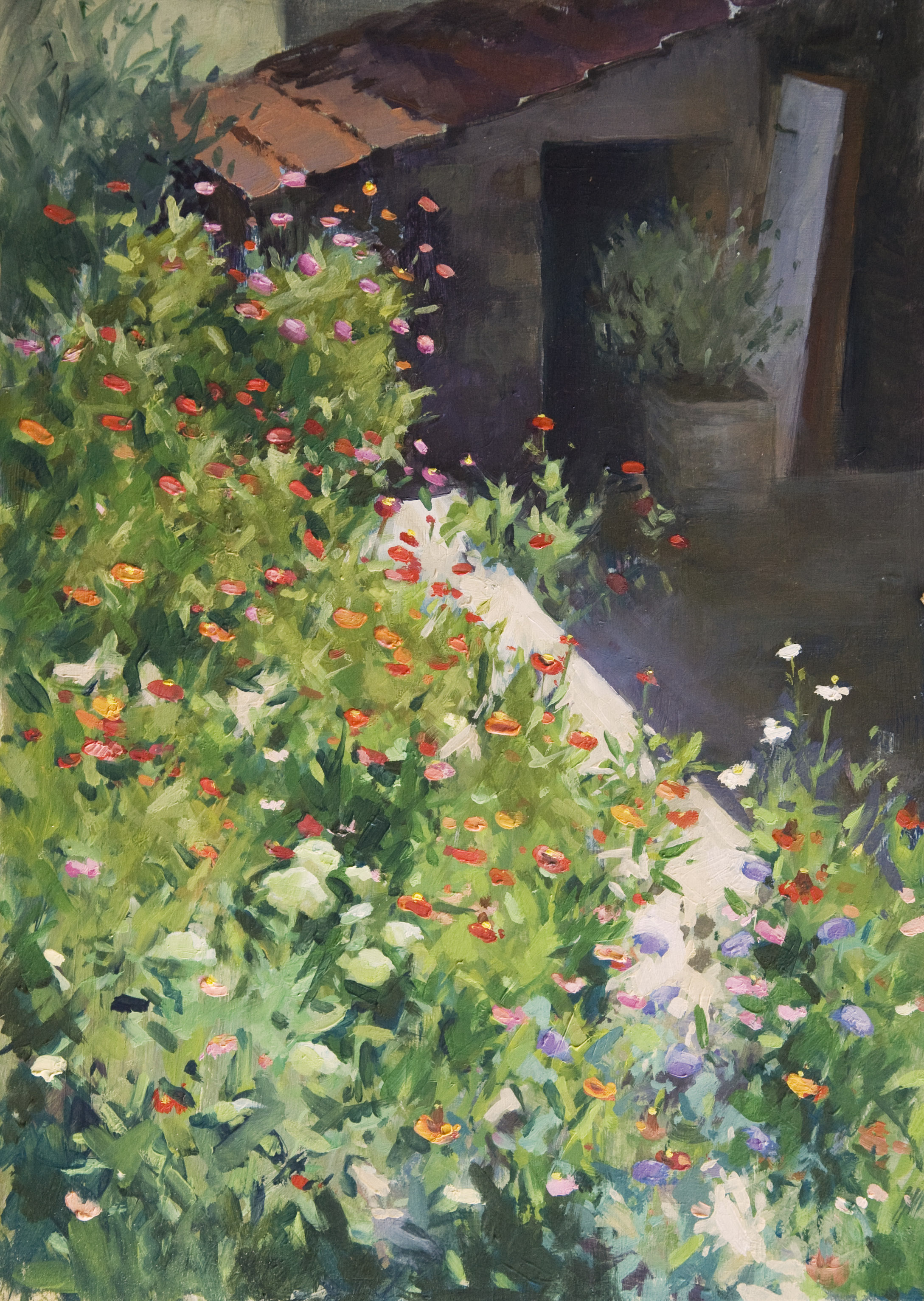
Our vegetable garden with sunflowers and cucumbers and various other things including my children having a snack 🙂

wisteriainbud
Wisteria before Bloom. 20cm x 30cm, oil on wood.

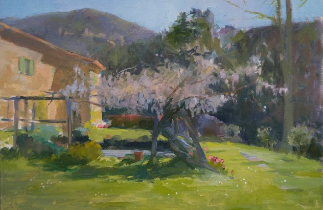
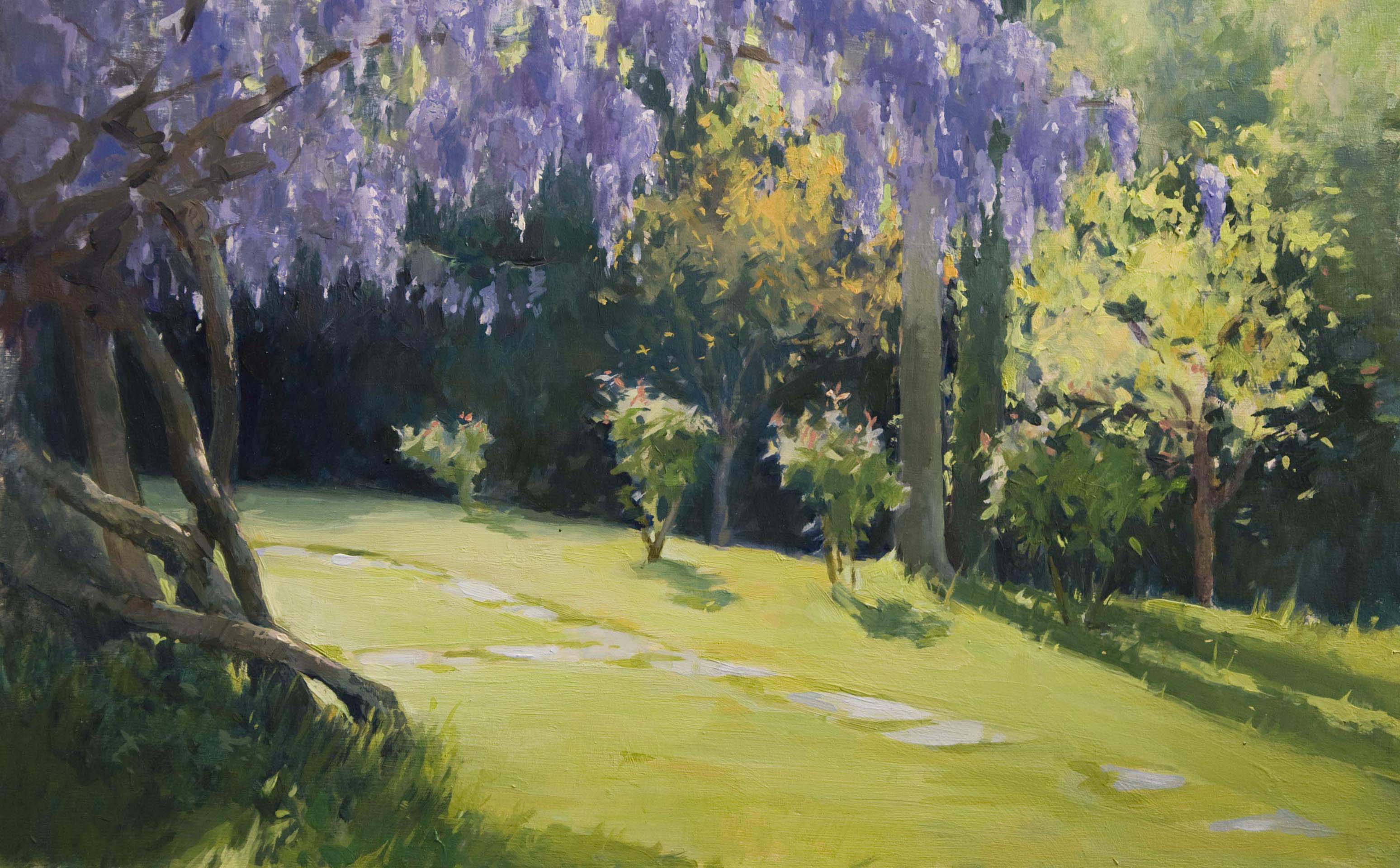
There is something I find a bit overwhelming when painting a Wisteria tree when it is in full bloom so here is a little sketch of it about to come into flower.

Ciao for now and just to keep up to date I will be posting some paintings from this summer soon!

Frogs, a cat ‘n dog and a fairy. A few sketches.

When I draw or paint a subject outside from life that doesn’t move much I find the painting process can sometimes give to longer sessions which in a way is a good advantage but then again also a disadvantage.  Things can start to get fussy because areas of the painting get rubbbed out to be seen in a different way and then painted over again, and so loosing the first impression.

Sketching moving things is a good exercise because your brain only has a short amount of time to memorize and decide on how to tackle the subject before putting it down in paint. There is no going back after the first brush stroke because there is probably no chance to do it again.  It’s a take it or loose it situation! These are good and fun exercises in learning to be more spontaneous with the paintbrush and in finding quick and simple compositions.

Painting the frogs was really interesting, even though they are not my favourite reptile I did get to respect and learn alot about who there were as they swam about in their habitat.  At the moment it is mating season and rivers and ponds are full of frogs and toads, they are not shy at this time of year and some can keep still for a quite a bit. These two who didn’t have hot dates were sulking at the bottom of the pool, giving me enough time to paint them.

frogs
Sketch of Two Male Frogs in a Pond. Oil on wood, 20cm x 25cm.
daisychain
Daisy Chain. Oil on wood, 20cm x 30cm.
catanddog
Cat and Dog Sketch. Oil on wood, 15cm x 17cm.

New Year

newyearsasetta2016b
New Year 2016, Sasseta. Oil on wood, 20cm x 30cm.

Sasseta is a typical Ligurian mountain village in the valleys behind the Cinque Terre, 55 people live here including me and my family and the surrounding area is called Zignago that has a community of 550 which covers an area of 2785 km, made up of rural farmland and woodland.

Sometimes Italy feels quite densely populated due to the geography of the land and many people live in the sprawling towns on the flat or as near to the coast as possible but right here in the mountains life slows down, less people want to live so remote and there is more space and fresh air even though the neighbouring wild boar can be pretty annoying!

I really enjoy painting the colours of the countryside in winter, so many reds, pinks and greys find their way onto the palette and with the recent mild weather the trees still have most of their orange autumn leaves still on the branches.

Thanks for stopping by!

The Back Terrace

The Back Terrace. Oil on Board, 25cm x 35cm.

Zinnia flowers are the lazy gardeners best friend. Last year I started off with just a few and this summer they had grown everywhere, a forest of colours attracting so many butterflies and hummingbird hawk-moths. They are late summers last burst of sunshine and even though autumn is here the sun is still shining on this terrace!

What struck me to paint this scene was the way that the brightly coloured flowers light up against the dark background which I think helps to break up some of the bushy leafy greens.  After a bit of experimenting to get the flowers to jump out I decided to dull down and darken the green leaves while using different variations of colour, value and chroma to keep the green interesting. To express the brightness of the flowers which bring a bit of excitement into an otherwise big area of green I tried to keep the reds as saturated as possible, paint does not come close to real life’s value range and it is suprising how colours in nature are brighter than the colours you can make on the palette!

Ciao!

Painting in the Valdettaro Boatyard.

Valdettaro Classic boats, 40cm x 50cm oil on linen.

A couple of weeks ago I went to an outdoor painting exhibtion where artists were invited to paint in a local boatyard harbour here in Le Grazie in Italy that was hosting a weekend of Regatta of Classic boats. It was great fun to be able to see so many beautiful classic sail boats. The weather was fine, the wind was good for sailing and the people friendly – it was a great weekend!

I dont really have much experience in painting boats and every boat I chose to paint in the foreground disappeared after half an hour so I never got to finish the masts and the rigging, a bit of memory was needed and also the help of the camera to remind me where to put the rigging was extremly helpful. It made me wonder how marine artists in the past were able to paint every little detail, it was either from memory or very careful sketching over long periods of experience spent in the boatyards. Mastering the art of human anatomy is probably the same sort of thing I imagine you would need to paint a boat.

During the time I was painting I tried a new medium for oil paint: Poppyseed Oil. The advantage of this oil is that it doesn’t yellow like linseed oil and it dries very slow which was an advantage when I added the rigging to the boats back in the studio because the sky hadn’t dried and I was able to work wet into wet. When using poppyseed oil the painting should be finished all in one go instead of waiting for layers to dry as it will crack if the layers havent dried properly and used underneath linseed oil should be avoided.  Linseed oil dries much faster, the only weak point is that when dry it tends to yellow or darken the whites and paler colours unlike poppy oil that is transparant.

Happy Sailing!

I Casoni in Liguria.

At the Top of the Hill. 20cm x 30cm, oil on board.
At the Top of the Hill, I Casoni. 20cm x 30cm, oil on board.
Up above Cuccaro Club. 20cm x 30cm, oil on board.

After a bumpy drive uphill you will find yourself here at 1000 metres above sea level, (maybe with a flat tire too), out of the hot weather and into cool breeze mountain views of Val di Vara that overlook the Ligurian sea.

Just outside Cuccaro Club (a hotel/restaurant that is more retro than my Granny), along the road leading to the Casoni where I chose to paint on a couple of occasions this summer, grows an imposing pine forest that covers several hectares. It is considered among the most beautiful of the Ligurian Apennines, with trees that stand out clearly against the grassy slopes. It was planted almost 100 years ago to stabilize the land in wet weather due to the intense deforestation that over the centuries, weakened the mountain slopes of the area. The work was ordered by Mussolini and involved a large number of workers. A sign of prosperity and longevity and facist propaganda. Hopefully it won’t come into the hands of another facist leader to fill in the holes in the roads…

Beach Etiquette

Al Mare. Oil on board, 14cm x 24cm.

Last week I was having a conversation with an Italian about the differences between the English and Italians on the beach in Italy. We noticed that when an English person embarks onto the sandy shores they will hunt for a secluded spot in the shade, lather on a fair amount of sun cream and immerse themselves in a book, remaining quiet and semi clothed until the midday temperature rises when they will use this opportunity to go and sizzle in the sun.
On the other hand the Italian will be heard arriving 1km away, habitat the most dinstictive spot on the beach and occupy unneccesary quantities of umbrellas and deckchairs. They will then stand around the deckchairs and talk non stop about food, last nights’ terrible sleep due to the heat and why it is too hot to even be at the beach.

This painting was done in the shade under the pine trees (being English) at the beach in Liguria I often go to. I liked this little view with Porto Venere and the Palmaria in the distance (once you get past the couple having a loud discussion about how “Basta!! This place is rompendo i coglioni and we have to go away to another beach immediately because someone has taken our reserved sun lounger”!  Finding shade is important when painting outside because working under the sun is hot and uncomfortable not to mention having sunlight on your canvas and pallet which will cause the values to be misjudged, i.e when you take your painting indoors you will find out you have painted everything too dark. If you have to paint in direct sunlight without an umbrella then you can mix your values lighter to compensate and if you have an umbrella dont attatch it to your easel on a windy day, you can imagine what would happen…it would be a case of a rompicoglioni moment!

The Palmaria, Portovenere. Italy.

Punta Secca, Portovenere. 25cm x 35cm, oil on board.
Punta Secco, Portovenere. 25cm x 35cm, oil on board.

The Palmaria is a small island near the Cinque Terre that lies infront of Portovenere and you can reach it by boat either from La Spezia or from Portovenere. With cool sea breezes and clear, clean blue waters it is by far the best place to be, both for swimming and sunbathing and especially painting. I look forward to going back and walking around the island which you can do in about one hour to search out more painting spots.

The first painting I did is looking toward the Gabbiano beach in the afternoon, the clear sunny colours and the beach stretching out into the sea inspired me to paint this view.

Sunbathers, Porto Venere. Oil on boad, 25cm x 35cm.
Sunbathers, Portovenere. Oil on board, 25cm x 35cm.

The second painting I did while using the same spot and same time of day when I painted the first painting but just turning around 180 degrees. Now the light was coming towards me so the church of San Pietro and the sunbathers were silhouetted against the sky which is an idea I like in this composition probably because the painting process was quicker as I was using a less colourful palette and concentrating mostly on the shapes.

Ciao for now!

Summer Evenings…

Winnie Drawing.  Oil on board, 20cm x 30cm.
Winnie Drawing (with Gwen and Lenny). Oil on board, 20cm x 30cm.

My favourite time of day for painting is in the early evening, around 5pm when the light is softer and the shadows a little longer. I am glad to show my daughter that painting or drawing nature is a valuable lesson and it is helpful for her to notice the small and simple things as well as all the wonderful colours that it offers which can sometimes go unoticed. P.S. My dog Gwen who is a retired sheepdog likes to keep watch over the cat now that she has no sheep!

Purple Haze

Wisteria.  Oil on board, 26cm x 42cm
Wisteria. Oil on Board, 26cm x 42cm

One of the most exciting things in Spring is waiting for the Wisteria to burst into cascading purple flowers (yes, my life is pretty exciting 😉 ) but after painting this I am pretty glad to wait another year until it flowers again.

Apparantly purple is a colour linked with royalty and mystery and it is also a difficult colour for our eye to discriminate because it has the shortest wavelength in the light spectrum. I definently found this to be true while painting and comparing the flowers to the green grass!